Now, as it turns out, Balsamiq isn't a great prototyping tool—it is meant for rapid storyboarding and wireframing. Even though it does have options for easily linking mock-ups together in a flow, it is not great at organizing dozens of screens per project and breaks down quickly for complicated interactions. For my purposes, though, it works well enough. It doesn't have a way to show hover states, tooltips or single versus double-click, but that isn't necessary for what I'm trying to do here. Also, I came up with a naming convention for my files to keep the four use cases separate within a single project which at the moment is 31 different screens.
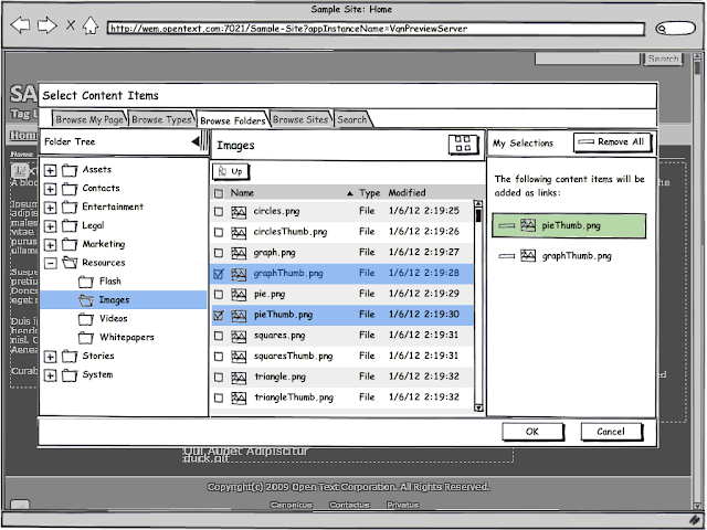
My favorite new feature that I've implemented is for the single and multi content item pickers. I had decided early on that users should be able to "drill down" through Folders and Channels to select content from within the grid view; in the current system, they must use the tree to navigate the hierarchy. In addition to adding the drill down option, I decide to also allow the user to hide the tree altogether and widen the grid view, relying solely on drill down.
 |
| Multiple content item picker with tree and grid |
 |
| Multiple content item picker with tree hidden (grid only) |
Robin and I met yesterday to review my first round of designs. I got some good feedback and need to do a little clean up to polish the prototypes for testing. We're going to meet with Tanya on Monday to discuss user testing. I'll be coming up with user tasks and probably writing the test script so I started reading Steve Krug's Rocket Surgery Made Easy yesterday; it is a how-to for discount usability testing. I read his first book, Don't Make me Think, a couple of years ago and have wanted to read this one too. I think it will be a helpful refresher.
This all sounds great, including your amusing reading (great titles!). Thanks for including screenshots in your blog; together with your thorough text, they make it easy for me to keep track of what you are up to and to understand your goals.
ReplyDelete