24 February 2012

Week 6: Writing a Usability Test Plan

On Monday, Robin and I met with Tanya, who does most of the usability testing for the User Experience team.  I quickly showed her the four picker models I've been working on and got a little feedback about getting these user tested.  She said they look fine and wanted to know if we'd like to use customers as test participants.  We agreed that having two customers would be good so that we could get some "real users" to look at these designs, but I'll also be using two people from the iSchool and two internal employees—one who has been using another content management product for years but will be switching over to WEM and another who has used older versions of WEM with a totally different interface.

So this week I have been focused on creating a usability test plan based on my initial designs.  I've been attempting to break them up into measurable tasks and constructing a scenario as a common thread through the test.  Tanya sent me the template they usually use and I have been creating my own based on that in combination with some of the info from the usability testing book I've been reading.  Additionally, I've been figuring out the technology needs required for both recording screen captures of the tests and broadcasting them to remote observers.  Internally, we use Camtasia for recording and Microsoft Live Meeting for online sharing.  I was able to get a Camtasia license and a Live Meeting account so I have been playing around and trying to learn how they work.

To demonstrate the screen capture and to show an example of how the my prototype functions, I created this short video:


The most irritating issue I'm dealing with at the moment is that Balsamiq isn't a prototyping tool, as I mentioned last week.  It is really intended for rapid wireframing of new concepts, not for creating elaborate, clickable mock-ups to demonstrate complex functionality.  I had only used Balsamiq previously for wireframing, not interaction design.  To create prototypes for websites, I would use at least some HTML and run them in a web browser. But, I think that would actually be more difficult for demonstrating a software interface so I am making my way carefully with Balsamiq.

I'm up to 50 different screens for my designs as this sort of prototyping is like painfully slow, single frame animation.  I have to make sure all my links between frames are correct and provide the necessary functionality to replicate something of a working interface.  There is another product called Flairbuilder that can import data files created with Balsamiq (using the .bmml file extension) that I would look into if I need to do more of this kind of prototyping in the future.  For now, I still have a lot of rework to do of the designs to get them in line with my usability test tasks.

17 February 2012

Week 5: Milestone 1

Wow, a third of the way through the project already and up to my first milestone.  This week I was completely heads down with interaction design.  I kept pretty thorough notes based on each use case with a checklist of modifications I wanted to make to each picker type.  I spent some time at the end of last week and the beginning of this week re-familiarizing myself with Balsamiq and how everything works.  What I really like about that tool is how easy it is to move and place your symbols on the canvas.  Since you can directly manipulate x, y coordinates and width/height, it is super simple to get everything to line up from screen to screen.

Now, as it turns out, Balsamiq isn't a great prototyping tool—it is meant for rapid storyboarding and wireframing.  Even though it does have options for easily linking mock-ups together in a flow, it is not great at organizing dozens of screens per project and breaks down quickly for complicated interactions.  For my purposes, though, it works well enough.  It doesn't have a way to show hover states, tooltips or single versus double-click, but that isn't necessary for what I'm trying to do here.  Also, I came up with a naming convention for my files to keep the four use cases separate within a single project which at the moment is 31 different screens.

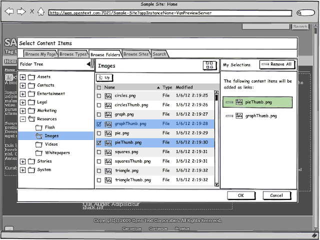
My favorite new feature that I've implemented is for the single and multi content item pickers.  I had decided early on that users should be able to "drill down" through Folders and Channels to select content from within the grid view; in the current system, they must use the tree to navigate the hierarchy.  In addition to adding the drill down option, I decide to also allow the user to hide the tree altogether and widen the grid view, relying solely on drill down.

screen shot of multiple content item picker with tree and grid navigation
Multiple content item picker with tree and grid

screen shot of multiple content item picker with tree hidden, expanded grid size
Multiple content item picker with tree hidden (grid only)

Robin and I met yesterday to review my first round of designs.  I got some good feedback and need to do a little clean up to polish the prototypes for testing.  We're going to meet with Tanya on Monday to discuss user testing.  I'll be coming up with user tasks and probably writing the test script so I started reading Steve Krug's Rocket Surgery Made Easy yesterday; it is a how-to for discount usability testing. I read his first book, Don't Make me Think, a couple of years ago and have wanted to read this one too.  I think it will be a helpful refresher.

10 February 2012

Week 4: The Users Speak and Design Commences

This week, I had the chance to speak with a group of users and observe them using the 8.0 version of WEM. This is a company that has been using the Vignette Content Management product for many years and is still experiencing some growing pains while transitioning to the updated user interface of WEM. The person doing most of the "driving" during the screen share session was a guy who had not used the new interface much and not at all for some of the tasks. He still uses the "console" interface, which admins can still access, instead of the new "workspaces" model, aimed mostly at end users.

It was an interesting and terrifying experience to speak with customers live like that. I wasn't alone either; in the room with me were three other members of the UX team, including the team lead. The customers were very nice and very vocal, quick to voice their opinions about all aspects of the UI, not just the picker tasks I was asking them to perform. We got a lot of good feedback on other issues, like the tree nodes indicating that there are child nodes when there aren't; direction on how they like to seek, search and browse for content in the system; and concerns with changes that were made to the preview site menus and controls.

Most of what they about the pickers were known issues but it was still valuable for me to see people struggling with some of the UI inconsistencies.  Still, after a little practice, the user seemed to perform repetitive tasks pretty easily, like remembering that you have to stop one node higher in the tree than the channel or folder you'd like to select.  One UI suggestion he made had to do with adding content items to the "Your Selections" pane; he said that instead of using the "Add to Selections" button, he thought having an arrow pointing from the grid to the selections pane that the user would need to click to "move" the selected items might be better.  I will keep this in mind in case my design idea doesn't test well.

I finished up my assessment of the four picker types this week and moved into my initial design phase. The first thing Robin asked me to do, though, was to write up scenarios for what I intended to design in order to make it clear what problem I was trying to solve. I wrote all my uses cases based on the "Kristen" persona that OpenText uses:
Kristen, a content contributor, for whom web content management is not the focus of her job.  She enters content infrequently and needs the process to be easy and intuitive. She is not very computer savvy and is an expert in an area unrelated to the website like a nurse, HR administrator or legal assistant.
These are the four uses cases I will be designing for:
  1. Selecting a Folder for a New Content Item
  2. Selecting Channels for a New Content Item
  3. Adding a Content Item to a Content Component
  4. Adding Related Links to a Content Item
I started with use case one:

Kristen needs to enter a new article into the content management system. After entering her content, she wants an easy and consistent way to select a Folder for her article. She doesn’t want to see every Folder in the system, only those she has access to where she might want to save her content items. She thinks it might be useful if she could search for Folder names instead of having to drill down to select them. She thinks it would be a neat feature if she could create a new Folder if she can’t find one that is appropriate for her article. She needs a clear indication of which Folder she has selected and clear direction for how to save her selection.

Below are screen shots of the current design and then my first low fidelity mock-up:

WEM 8.1 folder picker

My initial folder picker design
 Some of my design changes include:
  • Moving the "selection" pane from the bottom to the right to be consistent with content item selectors
  • Removing the "browse" pane and expanding the "tree" pane to accommodate deep hierarchies with minimal sideways scrolling
  • Removing the "All Folders" root element to lessen visual clutter and to eliminate the possibility of collapsing the entire tree
  • Removing the "plus" icons from tree nodes that do not contain child nodes
I purposely use "sketchy" design widgets (courtesy of Balsamiq Mockups) and minimal color so that people viewing these designs do not get distracted by look and feel elements and can concentrate on functionality. For the final set of mock-ups, I will probably create high fidelity versions that use the WEM interface design.

My first milestone is next Friday at which point I should have mock-ups created for each of the four use cases above.
03 February 2012

Week 3: Deep Dive

This week has been busy as I try to go deeper into the problem while narrowing my focus. At our weekly meeting, I showed Robin the use cases I was working on as well as the design examples of other pickers that I collected. She was quite interested in the examples and said that research will be good to keep. She asked that I look at creating four different design scenarios with a UI approach that makes each of the pickers nice to use but also relate to one another:
  1. Single content item picker
  2. Single container picker
  3. Multiple content items picker
  4. Multiple containers picker
She also asked that I look at making the process of picking flow from left to right in all instances, ending with the user clicking the "OK" button to commit the selections. I started trying to think about what these have in common so that I can abstract one process, one flow:
  • User needs to select something
  • User needs to know what s/he has selected
  • This needs to be easy and similar regardless of what is being selected and regardless of how many items are being selected
  • What are the various states? What does it look like when something has been selected?  What explicit notifications should the system give the user?
I started with exploring how the existing multiple content item picker works in detail. I think it is important to utilize and maintain existing controls and concepts so that the user doesn't have to think too much about what s/he is doing. I kept selecting items, one, then many, over and over, seeing what happens if I click on a row versus a checkbox, multiple checkboxes then a row, etc. It was easy to see how this paradigm of selecting items becomes transparent when implemented well. Where the current picker system seems to break down most is that the act of selecting an item doesn't really select it; the user must then click the "Add to Selections" button, then click "OK" to commit the selections.

The current multi-item content picker doesn't have a clear flow.
I think if the act of clicking a row or checkbox automatically adds the item to the list of selections and if confirmation of that action is made obvious through system notifications, this will become much easier to use. I came up with over a dozen changes I would make to this process flow alone, though many should abstract to a new general picker model. Over the next few days, I will perform the same analysis on the other three picker types.

This week, I also had a chance to hear what real, external customers think about the 8.0 UI. I was able to sit in on a customer gripe session with the WEM product manger and Tayna Payne, Senior User Experience Designer, who led the session (and who coincidentally attended the same PhD program at the University of New Mexico as my dad in the late '80s). She's hoping to set up a more technical session next week where we'll have a chance to discuss the pickers and their issues with these same customers in great detail. I am really looking forward to hearing some additional perspectives on this problem and, I hope, will get to see them actually using the pickers.

On a personal note, I am finding this project really puts me outside my comfort zone. I am anxious a lot and find myself waking up thinking about pickers! This type of project is hard for me for a couple of reasons, the first being that it is really undefined in a sense. I have to be creative and try to solve a problem that doesn't exactly have a right answer and that is very uncomfortable for me because I am used to doing very precise, specific tasks. The second reason is that the project is so spread out and it is hard to focus on it for only a few hours at a time amidst my other class and the three major work projects I'm engaged with too. The creative process is just different than most of the work I'm used to and it probably doesn't help that I have a low tolerance for ambiguity. I think as the project becomes more refined over the next couple of weeks that I will start to feel more comfortable. My first mile stone is at the end of week five when I should have a preliminary design ready for review.  By the second milestone at week 10, Robin is hoping to get my design user tested so that by the end of the project, I have had a chance to refine it and make changes based on outside user input.